Children in rich countries are much less likely to die than a few decades ago, but we rarely hear about this progress
In most rich countries, child mortality has more than halved in the last thirty years; we know we can go further.
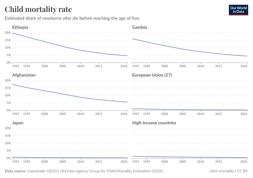
As recently as 1990, one in five newborns in Ethiopia would die before the age of five. This was the norm across many poorer countries. Since most couples would have more than five children, many parents had to see one of their children die. If you were born into one of these families — and among those that survived — there’s a high chance that you would have grieved the loss of a brother or sister.
But in the last 30 years, child mortality rates have plummeted in low-income countries. In Ethiopia, they’ve dropped from 20% to 5%, as shown in the chart below. The Gambia and Afghanistan are just two more examples of countries with dramatic declines.
I’ve also shown the change in rich countries on the chart. From this way of looking at the data, it might seem that child mortality is no longer an issue in rich countries. Their rates are very low and barely visible compared to many other countries. It also looks like almost no progress has been made in the last 30 years: mortality was low and is still low.
But I think both of these conclusions are wrong. Countries in the European Union, Japan, South Korea, the United Kingdom — the list goes on — have made childhood much safer in my own 30-year lifetime.1 It’s just something we rarely hear about. I also don’t think that this is a “solved problem”; it is still too common for parents to see their children die, and there’s a lot more that we can do to save their lives.
We have this perception because we compare countries by their absolute reduction in child mortality. Many low- and middle-income countries have reduced these rates by 5, 10, or 20 percentage points over the last 30 years. Of course, that would be impossible for many richer countries: the child mortality rate in the European Union (EU) was around 1% in 1990, so the maximum reduction it could achieve in absolute terms would be one percentage point.
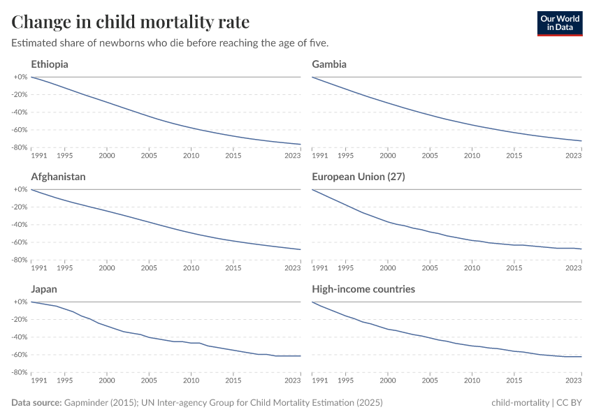
It’s only when we look at the relative reduction in child mortality that we see that rich countries have also made impressive progress.
The chart below shows these same countries — or groups of countries — plotted as the change in mortality rates since 1990. All of them have halved child mortality rates or more.
In the previous chart, progress in the EU looked a little underwhelming. But, in fact, rates have fallen by 69%. Even in Japan, one of the safest countries to be born in, child mortality rates have dropped by almost two-thirds. Those are not small reductions. Children are much less likely to die than they were in 1990.
Before studying this data, I probably wouldn’t have guessed that if I had a baby today they’d have less than half the risk of dying in childhood than I did.2 It’s progress that we almost never see on the news.
I think it’s important to highlight this point for two reasons.
First, the idea that progress on health has stalled (or even regressed) in rich countries is, I think, a common one. I’ve previously held that view myself. But it’s not true: improved treatments and vaccinations developed by scientists, dedicated care from doctors, midwives, and nurses, health policies developed by governments, and parents' choices have made things much safer for children even in the world’s richest countries. These efforts were not for nothing: they’ve given kids a future and spared many families the pain of losing a child.
Second, child mortality in rich countries is not a “solved problem”. 23,000 children still die in the United States every year. That’s around 50 times more than the number who die from natural disasters.3 And more than the total number of homicides.4 No one would say that murders in the US are a “solved problem”.
So it would have been wrong of us to accept or be happy with where we were in 1990, with around 1% of children still dying. I also think it would be wrong of us to assume that 0.5% is the level we should accept today; we know that we can save more lives.5
Acknowledgments
Many thanks to Max Roser and Edouard Mathieu for feedback and suggestions on this article.
Continue reading on Our World in Data
Where in the world are babies at the lowest risk of dying?
It’s difficult to compare countries because they don’t always measure infant mortality in the same way.
Child mortality: an everyday tragedy of enormous scale that we can make progress against
We live in a world in which ten children die every minute.
Mortality in the past: every second child died
The chances that a newborn survives childhood have increased from 50% to 96% globally. How do we know about the mortality of children in the past? And what can we learn from it for our future?
Endnotes
I was born in 1993.
I was born and still live in the United Kingdom, where child mortality rates have fallen by over 50% since the early 1990s.
The annual average of 436 disaster deaths in this decade is similar to previous decades, too.
23,000 / 475 = 52.8 times.
In 2021, there were around 18,800 homicide deaths in the United States.
0.4% is the average in the European Union, and 0.6% is the rate in the United States.
Cite this work
Our articles and data visualizations rely on work from many different people and organizations. When citing this article, please also cite the underlying data sources. This article can be cited as:
Hannah Ritchie (2025) - “Children in rich countries are much less likely to die than a few decades ago, but we rarely hear about this progress” Published online at OurWorldinData.org. Retrieved from: 'https://data-world-bank-pip.owid.pages.dev/child-mortality-rich-countries-decline' [Online Resource]BibTeX citation
@article{owid-child-mortality-rich-countries-decline,
    author = {Hannah Ritchie},
    title = {Children in rich countries are much less likely to die than a few decades ago, but we rarely hear about this progress},
    journal = {Our World in Data},
    year = {2025},
    note = {https://data-world-bank-pip.owid.pages.dev/child-mortality-rich-countries-decline}
}
Reuse this work freely
All visualizations, data, and code produced by Our World in Data are completely open access under the Creative Commons BY license. You have the permission to use, distribute, and reproduce these in any medium, provided the source and authors are credited.
The data produced by third parties and made available by Our World in Data is subject to the license terms from the original third-party authors. We will always indicate the original source of the data in our documentation, so you should always check the license of any such third-party data before use and redistribution.
All of our charts can be embedded in any site.

